Everything I Know About UX, I Learned from a Rubber Chicken
What Monkey Island and other SCUMM games got right about UX
This post was written with heavy AI assistance. The ideas are mine, but the words may not be. Here's why I stopped doing this.

Quick disclaimer before we begin: I’m not a UX expert, just a developer who cares a lot about how things feel. Years of building interfaces (and playing too much Monkey Island) taught me that good design is often invisible… but unforgettable.
Funny enough, some of my earliest lessons in user experience came not from design tools… but from pirate ships and rubber chickens. Yes, rubber chickens. With a pulley.
Before Figma, before design systems, before “microinteractions” were a thing… there were verbs. Open. Push. Talk to. Pick up.
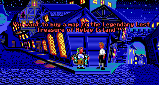
If you’ve played Monkey Island, Day of the Tentacle, or Maniac Mansion, you already know the SCUMM interface. A pixelated, point-and-click UI that somehow managed to be more intuitive and charming than many modern apps.

These games weren’t just fun, they nailed UX fundamentals that product teams today still struggle with.
Here’s a treasure chest of timeless UX lessons I’ve gathered from years of adventuring through SCUMM classics.
Discoverability: No Treasure Maps Needed
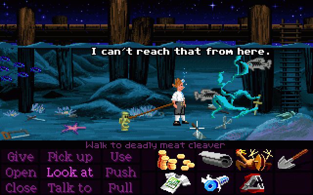
The verb-based UI gave you all your options upfront. No guessing, no hidden features, everything you could do was right there on the screen.
Compare that to today’s apps: cryptic icons, overloaded menus, keyboard shortcuts that feel like secret spells. Features vanish into sidebars or appear only if you say the magic words (or click the three-dot menu for the seventh time).
Interfaces shouldn’t rely on memory, they should invite discovery. A visible interface is a learnable one.
Feedback: Even the Wrong Moves Tell a Story
Every action had a response, even the “wrong” ones.
Try to “Pick up the tree” in Monkey Island, and you don’t get silence or a dead pixel. You get “I don’t think I can pick that up.”
That’s better than nothing happening, which is still common in today’s web apps. Even idle animations (like Guybrush fidgeting) added personality and life to the interface.
Feedback makes systems feel alive, not rigid. Even error states can show respect for the user.

Affordances: Click Me, Matey!
Affordances are the clues that tell you what something does. A lever looks like it can be pulled. A door looks like it opens. In SCUMM games, clickable things looked clickable. Imagine that.
Items changed state when picked up or used. Objects reacted in consistent, logical ways. You could trust the visual language.
Modern UIs still fumble this: buttons disguised as labels, invisible hover states, disappearing controls that play hide and seek.
Give users clear signals. If it does something, make it look like it does something.
Constraints Are a Feature, Not a Curse
SCUMM interfaces kept it tight. 12 verbs max, one inventory bar, one context area.
That limitation was a feature, not a bug.
Every action had a reason to exist. Every item told a story. There was no room for bloat, which forced focus and intent.
Modern tools often suffer from feature sprawl. But UX isn’t about giving users everything, it’s about helping them do the right thing.
The best design often comes from editing, not adding. Less can be a lot more.
Users Want to Feel Smart, Not Tricked
SCUMM puzzles made you feel clever, except that one with the monkey wrench that felt like a cruel joke.
UX should reward intuition, not hide the exit door behind a secret handshake. As Steve Krug said: “Don’t make me think.” (probably should put this one in my reading list).
SCUMM games made you think, but the right kind of thinking. The “aha!” kind, not the “Where did my button vanish?” kind.
Don’t confuse users just to feel smart. Design flows that reward their intuition.
Delight Matters - Even in Failure
Too many modern apps act like airport kiosks. Efficient, cold, and completely forgettable. SCUMM games? Even failure came with a wink.
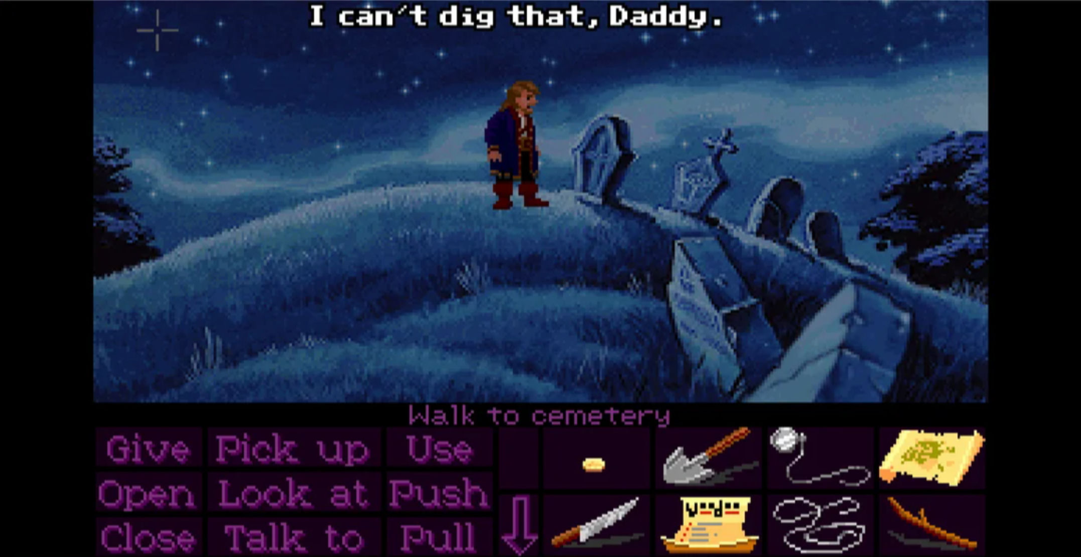
SCUMM games didn’t just function, they entertained. Fail to dig the grave of your enemies’ ancestor? You’d get: “I can’t dig that, Daddy.”
No dead ends, no cold error messages, just personality and charm.
Modern software often forgets that users aren’t just completing tasks, they’re having experiences. Personality builds connection. And a little humor or quirk can make your product unforgettable.
Even the smallest detail can be a smile trigger.

Wrapping Up
SCUMM games might look like relics of a simpler time, but the design thinking behind them is anything but outdated.
As devs and designers, we still chase the same goals: clarity, engagement, and that elusive feeling of flow.
Sometimes, looking back at 320x240 pixels of pirate adventures can help us build better software today.